
Home & Garden
The Best Exterior White Paint Color and How to Choose the Right One
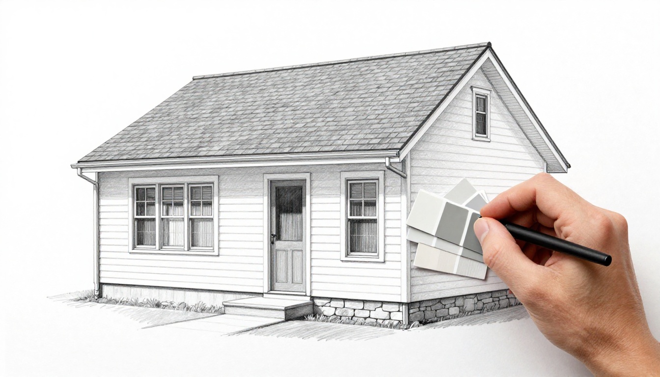
White seems simple until you stand outside with paint chips at 3 pm and everything looks… beige. Or blue. Or oddly pink. Choosing the best exterior white paint is less about finding “the prettiest white” and more about finding the white that behaves on your house.
In this post, I’m sharing the decision framework I use for white siding and white trim, plus a curated shortlist of specific, reliable whites (with undertones, pairings, and the times I’d skip them). If you want that bright magazine look without repainting in a year, this will save you time.
My decision framework for choosing exterior white paint (siding + trim)
When I’m picking an exterior white, I start with what can’t change easily. Then I choose the undertone that makes those fixed elements look intentional.
Here’s my quick framework:
- Lock in your fixed elements first: Roof shingles, stone, brick, hardscape, and window frames don’t “blend” with white, they either sing or clash. I hold samples right up to those materials, not just the siding.
- Decide what “white” means for your home: Do you want crisp and modern, or soft and classic? In March 2026, the trend is still leaning away from stark whites and toward softer off-whites, which tracks with what I’m seeing in real neighborhoods too (see Brick&Batten’s 2026 exterior color roundup).
- Match undertone to your exposure: North-facing homes and shaded lots push whites cooler and grayer. Full sun can make warm whites look creamier fast.
- Choose a siding white, then a trim white: I like trim that’s slightly cleaner or slightly brighter than the siding. If both are the exact same white, details can disappear.
- Test outside, vertically, for a full day: I paint two large sample boards and move them around. Morning, noon, and dusk can feel like three different houses.
My biggest “white paint” surprise is always this: the undertone shows up more in shade than in sun.
Exterior white paint colors I actually recommend (with undertones and pairings)
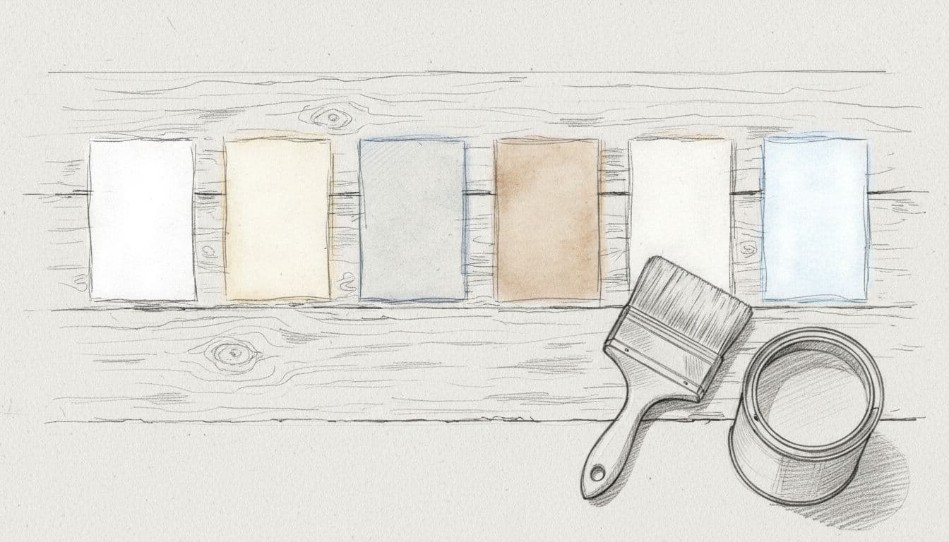
These are my go-to options when someone tells me, “I want a white exterior, but I don’t want it to look weird.” I’m including notes for siding and trim because they don’t always behave the same.
Before the deeper notes, here’s a quick side-by-side for scanning:
| Color | Undertone | Best for | Pair with | Notes |
|---|---|---|---|---|
| Sherwin-Williams Alabaster | Warm, creamy | Traditional, farmhouse, shaded lots | Warm stone, bronze, natural wood | Forgiving; can look creamy next to bright white windows |
| Sherwin-Williams White Snow (SW 9541) | Clean, minimal | Modern homes, bright sun | Black windows, charcoal roof, crisp trim | Can look chilly in deep shade |
| Sherwin-Williams Sanctuary | Warm off-white | Low-light exteriors, cozy curb appeal | Aged brick, warm gray roofs | Not the pick if you want sharp, gallery-white |
| Benjamin Moore Simply White (2143-70) | Slight warmth | Sunny homes, fresh look | Black, navy, medium woods | Can read creamy on north-facing shade |
| Benjamin Moore White Dove (OC-17) | Soft, balanced | “Safe” classic white for many styles | Greige stone, medium gray roofs | Less bright, but very livable |
| Benjamin Moore Balboa Mist | Light greige | Dusty roads, high contrast landscapes | White trim, black accents | Reads off-white; avoid if you want true white |
Now, how I’d use each one:
Sherwin-Williams Alabaster (warm and forgiving)
Alabaster is my comfort pick when the exterior has warm stone, tan hardscape, or a roof with brown notes. It gives that “fresh but not blinding” look. On textured siding, it hides small flaws well because it’s not too sharp.
Best pairings: natural wood doors, oil-rubbed bronze, warmer grays.
When I avoid it: if you have bright white vinyl windows you can’t change. Alabaster can look creamy next to them.
Sherwin-Williams White Snow (crisp without feeling icy)
White Snow is a cleaner, brighter direction, great for modern exteriors and high-contrast details. If you love black windows, this one usually plays nicely because it reads fresh, not muddy. It also photographs beautifully, which matters if you share your home projects online.
When I avoid it: heavily shaded homes or dense tree cover. In that light, it can tip cold.
Sherwin-Williams Sanctuary (warm off-white for shade)
Sanctuary is the one I reach for when a house sits back in the trees, or the facade doesn’t get much direct sun. It keeps the exterior from looking gray and flat. If you like that soft, welcoming feel, this is a solid contender.
When I avoid it: contemporary homes that need a sharp, crisp white line.
Benjamin Moore Simply White 2143-70 (clean with a hint of warmth)
Simply White is bright, but it’s not sterile. I like it for sunny lots and coastal-inspired looks, especially with dark hardware and a bold front door color. If you want to read the brand details, start with the Benjamin Moore Simply White color page.
When I avoid it: north-facing exteriors with lots of shadow. That “hint of warmth” can show up more than you expect.
Benjamin Moore White Dove OC-17 (classic, soft, and steady)
White Dove is the calm, classic option I trust when you’re nervous about undertones. It has enough softness to work with stone and brick, yet it still reads white from the street. You can see its specs on the Benjamin Moore White Dove color page.
When I avoid it: when the goal is a bright, modern, extra-crisp finish. White Dove leans “timeless” more than “sharp.”
Benjamin Moore Balboa Mist (the “off-white” that hides real life)
If your home sits near a busy road, or you deal with dust and pollen, a barely-there greige like Balboa Mist can be a smart compromise. It reads as off-white, but it doesn’t highlight every speck of grime.
Best pairings: cleaner white trim, matte black lighting, warm wood.
When I avoid it: if you truly want a white house. This is a soft step away from true white.
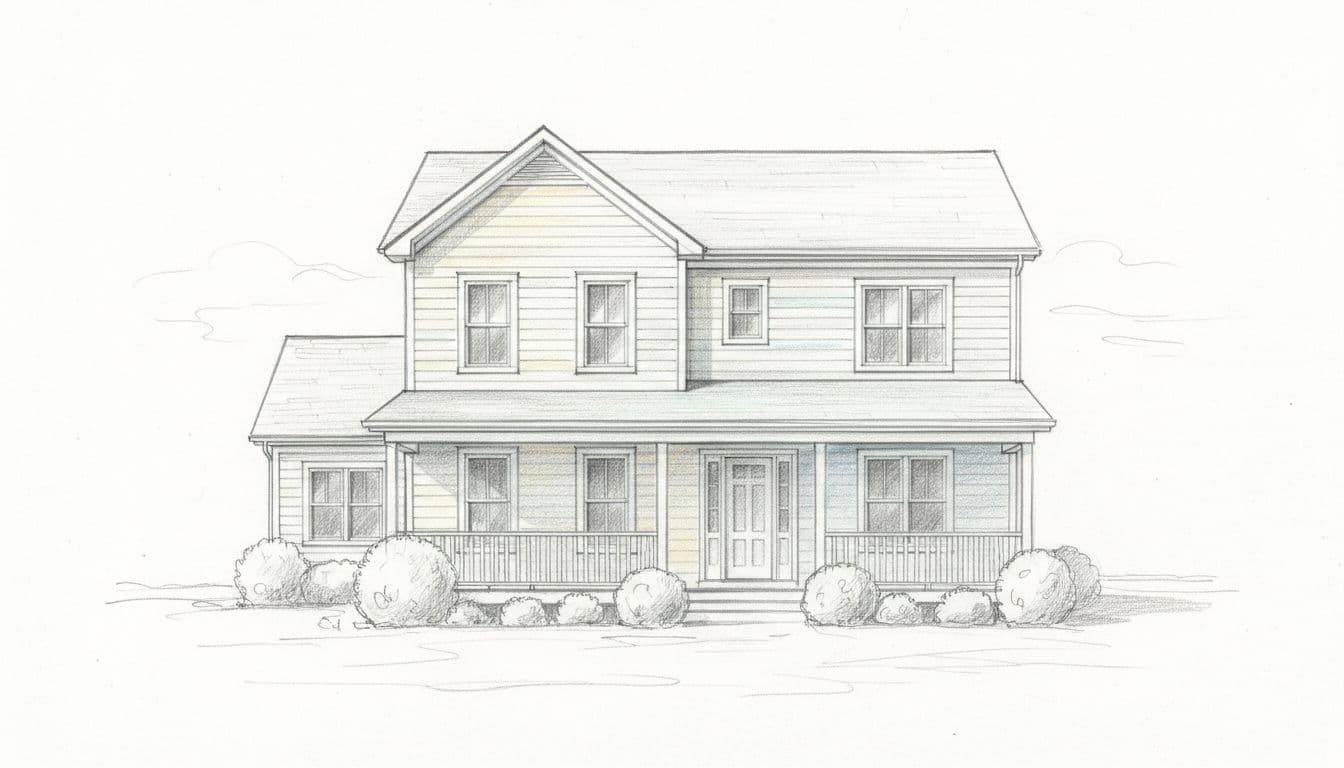
What can ruin a white exterior (UV, mildew, dirt) and how I plan for it

Photo by David McElwee
A white exterior is a little like a white sofa. It’s stunning, but you have to live with it. That doesn’t mean it’s high-maintenance; it just means choices matter.
Sun and UV: Bright sun can make warm whites look creamier and can fade dark accents faster. I choose UV-resistant exterior formulas and don’t skimp on prep. Peeling or chalky paint will show through white sooner than you think.
Mildew and algae: Humid climates and shady sides of the house grow green film over time. I plan for it with mildew-resistant paint and by keeping shrubs trimmed back for airflow. Also, sprinklers hitting siding daily is a recipe for streaks.
Dust and pollution: If you’re near traffic or construction, crisp whites show grime faster. That’s when I lean toward softer whites or off-whites, and I avoid ultra-flat finishes on trim.
Sheen choices: I like a low-luster or satin on siding for cleanability, and a satin or semi-gloss on trim for wipe-downs. Too much gloss on siding can highlight every lap mark and bump.
If you’re torn between two whites, pick the one that looks better on the shady side of your house. That’s where undertones reveal themselves.
Conclusion: my simplest rule for finding your “best” white
The best exterior white paint color is the one that matches your fixed materials, works with your light, and still looks good on the shady side at 6 pm. Start with undertone, then test large samples outside, and keep your trim a touch cleaner than your siding. Once you do that, choosing exterior white paint stops feeling like a gamble and starts feeling like a plan. If you’re sampling this weekend, take one photo in sun and one in shade, you’ll spot the winner fast.