Home & Garden
My Shortlist Of Best White Exterior Paint Colors
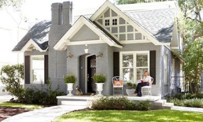
White looks simple until it’s on your house and suddenly it’s… blue. Or beige. Or weirdly gray by 4 pm.
After helping friends pick whites (and repainting my own trim more than once), I’ve learned this: white exterior paint colors only feel “right” when you match undertone, materials, and sunlight. In this guide, I’m sharing the whites I actually trust, plus how I sample, choose sheen, and coordinate trim, soffits, and the garage so the whole exterior feels intentional.
What makes a white work outdoors (and why swatches lie)
Outdoor light is harsh and honest. It turns a “perfect” warm white into butter, or makes a clean white feel icy. Before I pick anything, I look at three things.
First, I check fixed finishes I can’t change soon: roof color, brick, stone, hardscape, and even the driveway tone. A warm roof (brown, weathered wood shingles, warm gray) likes warm whites. Meanwhile, a cool roof (charcoal, black, blue-gray) usually looks best with neutral-to-cool whites.
Next, I think about the home’s shadows. Deep porches, big trees, and north-facing walls push whites toward gray. On the other hand, full sun can pull yellow out of warm whites and make them look creamy fast.
Finally, I remind myself that “white” isn’t a single color. Most whites have a quiet undertone: cream (yellow), greige (beige-gray), pink, or blue-gray. That undertone decides whether your house feels cozy, crisp, or slightly gloomy.
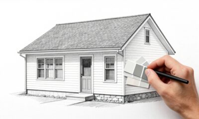
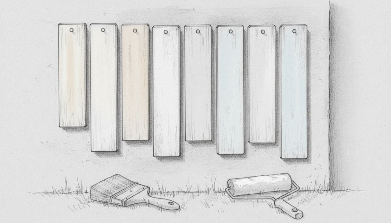
My rule: if a white looks perfect on a tiny chip, it will look louder on siding. I always test larger samples outside.
If you like seeing what’s trending, I keep an eye on exterior palettes each year. For 2026, warmer whites and creamy off-whites keep showing up alongside natural stone and wood, like in brick&batten’s 2026 exterior color roundup.
My short list of best white exterior paint colors (with undertones and pairing notes)
These are widely available and consistently recommended by painters and homeowners. Still, formulas vary by product line and sheen, even within the same brand. That’s why sampling matters.
Here’s the quick reference I wish someone had handed me sooner:
| Paint color (brand) | Undertone | Best use cases | Pairs well with | Watch-outs |
|---|---|---|---|---|
| Alabaster (Sherwin-Williams) | Soft warm, creamy | Siding, body color, also trim on warmer palettes | Charcoal roofs, warm stone, black or bronze hardware | Can read creamier in full sun, may look beige in deep shade |
| Pure White (Sherwin-Williams) | Neutral, slightly warm | Trim, soffits, doors, also body for modern homes | Black windows, cool gray roofs, crisp brick | Can feel stark on rustic stone, may look slightly gray on north sides |
| Extra White (Sherwin-Williams) | Cool-leaning, crisp | Trim, fascia, modern accents | Dark roofs, modern cladding, cool stone | Can look blue in shade, shows dirt more |
| White Dove (Benjamin Moore) | Warm off-white, gentle | Siding or trim when you want softness | Red brick, limestone, cedar, muted greens | Can look a bit creamy next to very cool grays |
| Simply White (Benjamin Moore) | Bright with subtle warmth | Trim, doors, or full exterior if you want “clean” | Black shutters, navy accents, medium-gray roofs | Can flash yellow on sunny elevations, looks brighter than expected |
| Swiss Coffee (Benjamin Moore) | Creamy, cozy | Siding on traditional homes, stucco | Terracotta, warm brick, tan stone, natural wood | Can read beige in shade, can feel too creamy with cool roofs |
| Polar Bear (Behr) | Clean neutral-to-cool | Trim, garage doors, soffits | Charcoal roofs, cool gray stone, modern palettes | Can read a little gray on shaded walls, less forgiving of grime |
If you want more background on why whites shift from surface to surface, I like this overview from Southern Living’s best white paint color guide. It’s written for interiors, but the lighting advice still applies outdoors.
One more pairing tip that saves me every time: if your home has lots of stone or brick, I choose the white by matching the mortar color first. Mortar is the quiet “neutral” that ties everything together.
Sampling, sheen, and coordinating trim, garage, and soffits
Sampling is where good choices happen. I skip tiny chips and do one of these instead: large peel-and-stick samples, or sample quarts brushed onto primed poster board. Then I move them around the house.
I check color at three times: morning, late afternoon, and after rain. Wet surfaces deepen undertones, so that “clean white” can suddenly look warmer.
For sheen, I keep it simple:
- Body (siding, stucco, brick): satin or low-luster reads smooth and hides small flaws.
- Trim (fascia, window trim, soffits): satin holds up and looks crisp without shouting.
- Front door: satin or semi-gloss depending on your door material and sun exposure.
Now for coordination, because mismatched whites are the easiest way to make a new paint job look off.
I usually pick one “main white” for the body, then adjust the rest by purpose:
- Trim: I go 1 step brighter or cleaner than the body (same color family), especially if the body is creamy.
- Soffits: I match the trim most of the time. If the soffits are always shaded, I avoid cool whites that can look blue.
- Garage door: I often tone it down slightly (either the body color or a soft greige) so it doesn’t glare. A bright garage door can steal attention from the entry.
If you’re stuck between two whites, choose the one that looks best on the most shaded wall. Shade is where whites can turn moody.
For current warm-white preferences (especially if you’re trying to avoid a cold, bright exterior), this 2026-focused take on the warm white trend is helpful: designer notes on warm whites.
Conclusion
The best white exterior paint colors don’t come from a single “top” list, they come from a good match between undertone, sunlight, and your home’s fixed materials. I start with the roof and masonry, test big samples outside, then coordinate trim, soffits, and the garage so nothing fights. Once you land on the right white, your landscaping, hardware, and front door color suddenly look more polished, too. If you’re repainting this year, what’s your one non-negotiable, cozy and warm, or crisp and bright?